The KarismaTrip identity
One mark, drawn once, generated everywhere — the navbar, the browser tab, the home-screen icon and the print PDF all read from the same geometry. These are the rules that keep it that way.
A K, an orbit, and one destination
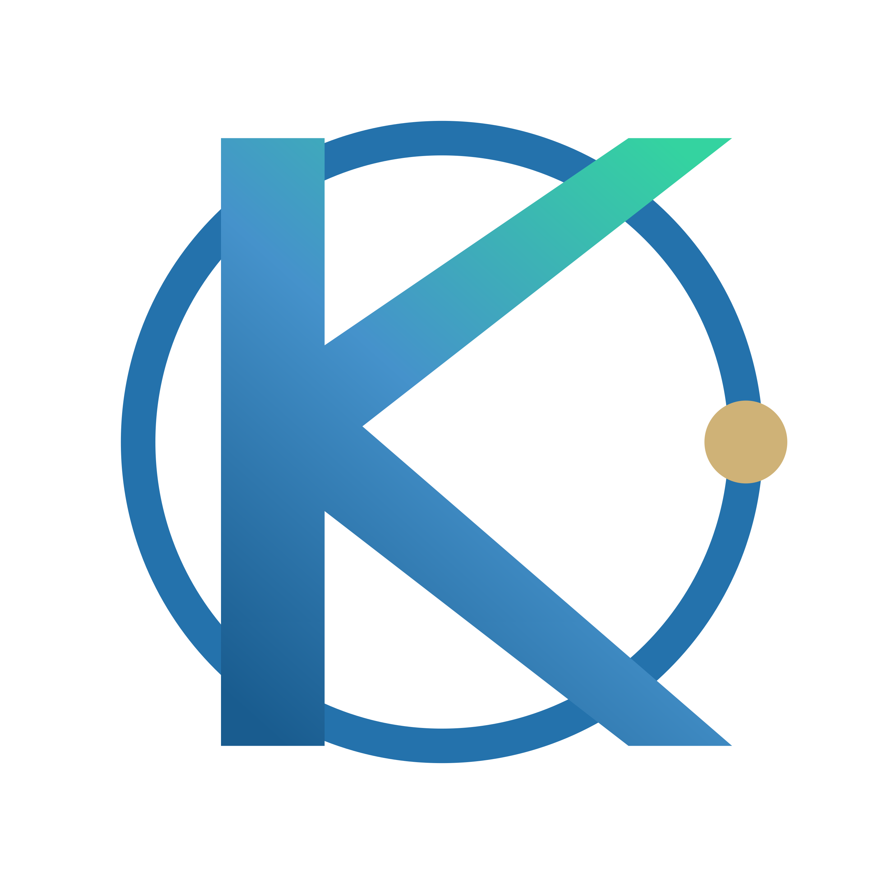
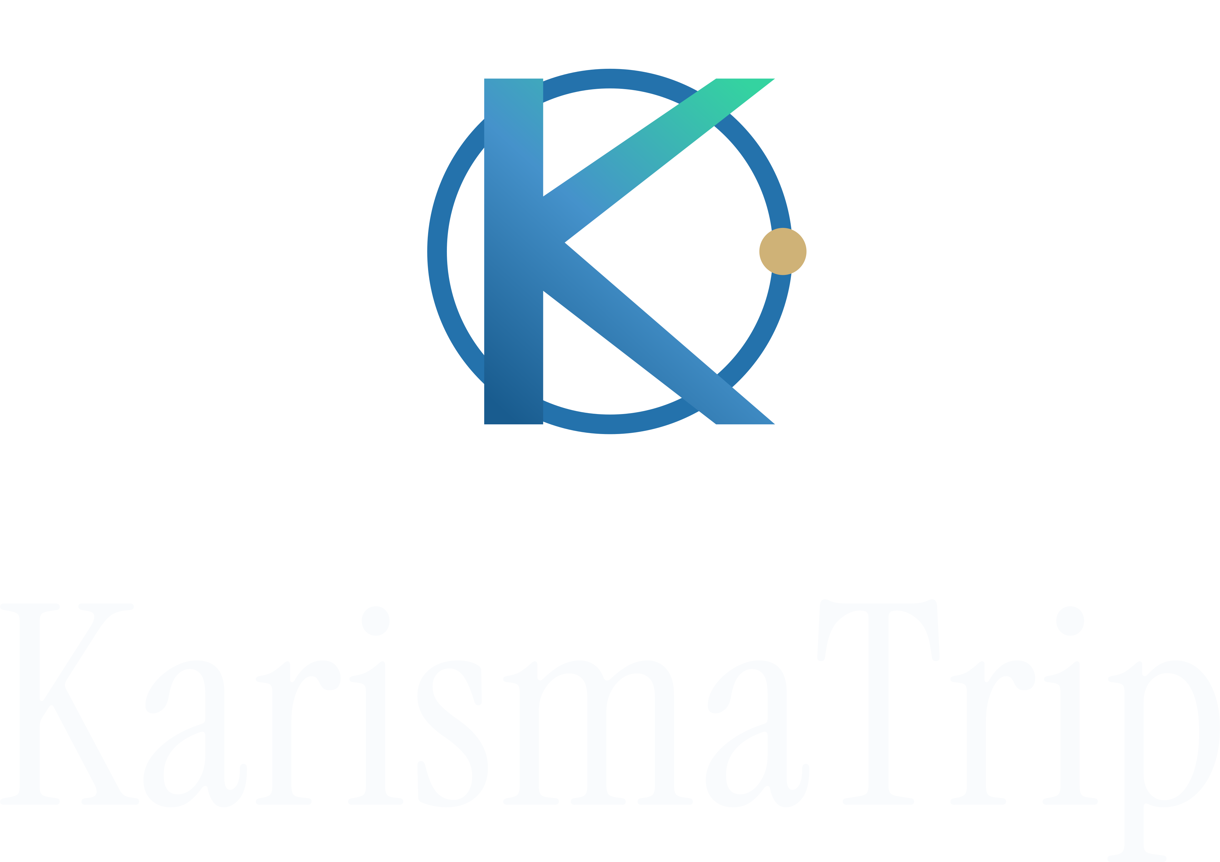
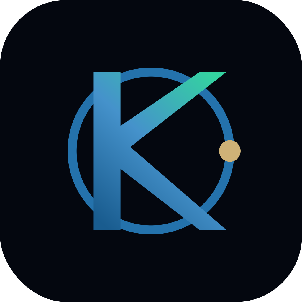
The K is the initial. It stands between the ring’s two horizontal tangents — its cap line and baseline are the circle’s own — which is what keeps the two elements reading as one object instead of a letter dropped inside a circle.
The ring is the world. The arm and the leg break out through it because that is what the product is for: looking past the border you happen to be standing behind. The stem stays inside the orbit’s left edge, so the circle never stops being a circle.
The gold node is the one place you are going, resting on the orbit inside the opening the two limbs make. There is only ever one, and that restraint is the luxury signal — gold used twice stops being precious.
Drawn on a grid
A 128-unit square. Ring radius 44, stroke 5, node radius 6. Every relationship is a ratio, so the mark can be redrawn at any size without being redesigned.
Straight lines only
Twelve points and no curves in the K. At 16px a curve is a smudge, and the mark has to survive a browser tab before it has to look good on a billboard.
No transparency
Print, one-colour reproduction and PDF each handle opacity differently. Every surface gets its own solid colour instead, which is why there are four palettes rather than one.
Three configurations
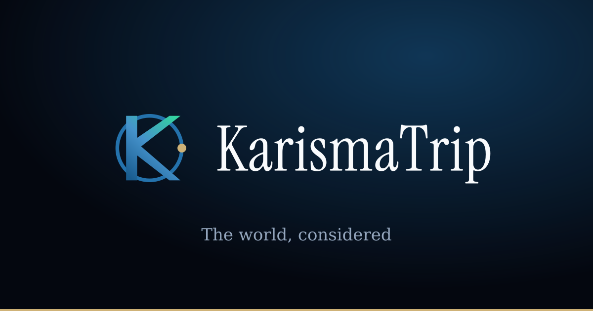
The gap and the cap height are fixed. Never compose the mark and the wordmark by hand — take a lockup, or the spacing will drift between one placement and the next.
- Horizontal
- The default. Wordmark cap height is 48% of the mark, set 22% away from it.
- Vertical
- For narrow or square placements. The wordmark steps down to 40%, because stacking already gives it the full width.
- Icon
- Wherever the wordmark would fall below 11px, which is roughly any placement under 90px wide.
Give it room, and a floor
Clear space is 9% of the mark’s height on every side — the diameter of the gold node. The rule comes from the artwork itself, so it stays true at any scale. Nothing enters that margin: no type, no rules, no image edges.
The horizontal lockup stops working below 24px tall — the wordmark fills in. The icon goes to 16px, but below 32px use the compact drawing, which thickens the ring and grows the node so neither disappears into the pixel grid.
Six values
Deep navy carries the brand, blue and teal carry the gradient, gold carries exactly one thing. Every value below clears 4.5:1 against the surface it is specified for.
Deep navy
#04070f
The canvas. Blue-black, never neutral black — pure black flattens the depth everything else depends on.
Royal blue
#2472ac
The primary. Links, the orbit ring, the middle of the gradient.
Ocean
#4592cb
The lighter primary, for dark surfaces where the mid-tone goes muddy.
Teal
#34d3a0
Live data and the end of the gradient. If it is teal, something is happening now.
Premium gold
#cfb277
The destination node, and nothing else. Desaturated on purpose — a saturated gold reads as a discount badge.
White
#f9fbfd
The wordmark on dark surfaces, and the light canvas. Slightly blue, so it sits in the same family.
Two faces, sharply separated
Instrument Serif
Display. Headlines, the wordmark, never below 24px and never for UI. One weight by design — there is no bold to ask for, and asking synthesises one that looks broken.
The wordmark is this face at +0.012em tracking, converted to outlines. It ships as paths, not text, so it renders identically where no webfont is available — print, PDF, an email client, a partner’s slide.
Geist
Interface. Every label, every paragraph, every number. Neutral and precise at small sizes, which is where most of this site is read.
Geist Mono — rates, coordinates, anything that should line up in a column.
Don’t
- Recolour the mark. Four palettes ship; one of them fits.
- Stretch, rotate, skew or flip it. The letter sits on the ring’s own tangents — rotating breaks the geometry that makes the mark work.
- Add a second gold element. There is one destination.
- Put the dark-surface artwork on a light background, or the reverse. Contrast is the whole point.
- Set the wordmark in another face, or re-typeset it. Use the outlines.
- Add effects — drop shadows, glows, bevels, outlines around the mark.
- Place the logo on a busy photograph without a solid or scrimmed panel behind it.
Download the kit
SVG for anything on a screen, PDF for anything going to print, PNG for the tools that accept nothing else. Every raster file is transparent unless it says otherwise.
Icon
The mark alone. Avatars, app icons, favicons, anywhere the wordmark cannot be read.

Horizontal lockup
The default. Headers, email signatures, anything wider than it is tall.

Vertical lockup
Stacked. Narrow columns, square placements, merchandise.
Application
The only assets that carry their own background.


The KarismaTrip name and mark are ours. The kit is here so partners and press can represent us correctly, not as an invitation to imply a relationship that does not exist. The wordmark’s letterforms come from Instrument Serif, used under the SIL Open Font Licence.